IDEXX Diagnostic Results, Redesigned
OVERVIEW
VetConnect PLUS is a diagnostic platform for veterinary professionals that centralizes all IDEXX lab results. It allows clinicians to order, track, and review tests from both in-house and reference labs, enabling faster, data-driven decisions that improve patient care.
CHALLENGE
The VetConnect PLUS team recently released an order tracking feature to give our customers clear visibility into an order’s progress. In post-launch research, we found that while users were utilizing the feature, they found it to be cluttered and cumbersome. While we knew of several improvements that could be made, the issue was deprioritized, leaving clear customer concerns unaddressed.
A deeper dive into our research repository uncovered a more significant, recurring theme: a clinician's time is their most valuable resource.
OPPORTUNITIES
We identified a clear opportunity to transform the home screen from a cluttered, non-actionable page into a powerful, streamlined tool that helps clinicians do their jobs better and faster.
Our solution focuses on:
Streamlining the experience to remove clutter and make it intuitive.
Making the home screen actionable so clinicians can find what they need immediately.
Designing a supportive interface that helps clinicians in the moments that matter most.
Prioritizing speed and efficiency to give valuable time back to clinicians.
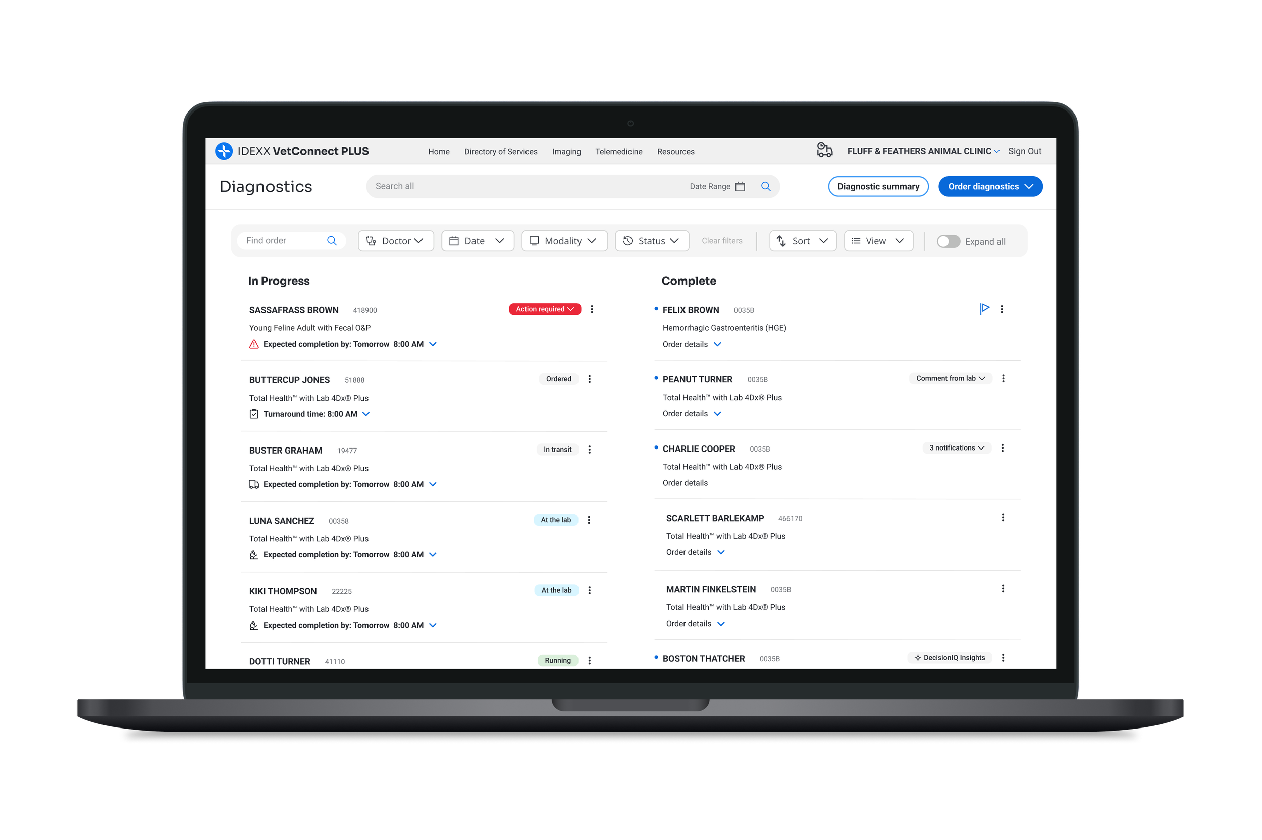
UI current state, post-launch of status tracker
INSIGHTS AND IMPACT
Recognizing this opportunity, I focused on translating these insights into meaningful workflow improvements. I began by documenting the findings, their potential impact, and the opportunities they presented, then distilled this research into a set of core themes.
My early-career clinical experience in veterinary medicine proved invaluable, helping me identify usability issues and provide deeper context. This, combined with close collaboration with other designers, was crucial for building a comprehensive picture of the user experience. Our partnership allowed us to assess usability challenges from multiple angles (for both users and the business) and brainstorm a richer, more creative set of solutions.
Workflow improvements
CORE THEMES
This framework of themes was essential for defining the core pain points and directly shaped the design solutions that followed.
BUSINESS ALIGNMENT
Care: We were focused on supporting the corporate goal of improving the customer experience. Our data showed a significant opportunity: the average customer contacted support over 100 times a year, with each call lasting about 10 minutes. We hypothesized that a lack of clarity and inefficient workflows within VetConnect PLUS were directly responsible for the top call-drivers: "I have a problem" and "I need information."
Do: To validate this, we leveraged customer support data as well as our own research. These insights confirmed that users struggled to understand order status and frequently cited "sample issue resolution" as their primary reason for contacting support. As one user stated, “There must be a more efficient way to do that.”
Impact: By redesigning these specific, high-friction workflows, we could address the core pain points that were validated by our thematic analysis. This directly supported the corporate goal of enhancing the customer experience and delivering significant business value by reducing support volume, improving user satisfaction, and boosting operational efficiency.

PROBLEM STATEMENT
The VetConnect PLUS home screen suffers from a lack of visual hierarchy and inefficient workflows, forcing users to contact support for tasks that should be self-service. This core inefficiency not only lowers user satisfaction but is compounded by a rigid layout that inhibits responsiveness and scalability. This poses a significant risk for future product growth and global expansion.
DESIGN PROCESS
With the problem statement defined, we began the design process by mapping the clinician's high-level journey and emotional state. This journey map allowed us to pinpoint key areas for improvement, revealing the design opportunities poised to make the greatest impact.
To identify key user tasks for the homepage redesign, we conducted a screen audit and an affinity mapping session.
Schedule a medical consult from the completed result
Resolve order issues flagged by the lab
Assign completed results to a doctor
Flag high priority orders (for very sick patients)
Automate sharing of negative results to pet owners
Complete a workflow and remove the order from the homescreen
User tasks
Initiate a new order or request
Obtain information about an order
Know when diagnostic samples have been picked up and delivered to lab
Monitor status of diagnostic result
Quickly navigate to pending or active orders (usually to give a doctor or pet owner an update)
Address critical lab alerts
Add to/Edit/Cancel an order
Once we had a solid understanding of the problem space, we officially moved into the design phase. Our primary goal was to ensure our design decisions were aligned with both user needs and business objectives by focusing on key themes and measurable outcomes.
Key Business & User Goals
Decrease time spent on tasks
Reduce calls to Customer Support
Boost user engagement
Improve customer satisfaction
Iteration & Collaboration
We refined our solutions through iterative design and consistent collaboration with key stakeholders, including product managers, engineers, UX researchers, and business analysts.
This cross-functional approach allowed us to:
Validate ideas early and often
Align priorities across disciplines
Incorporate diverse perspectives into our solutions
This process culminated in a well-defined strategy—grounded in a thorough understanding of the clinician's workflow—that delivered a cohesive, user-centered experience.


HOMEPAGE DESIGN VISION
After several rounds of internal collaboration, we landed on a design vision that allows users to be informed at a glance, explore with ease, and act with confidence. Our solution solves core problems through an evolutionary approach—rather than a complete revolution—maintaining key visual threads to ensure the new UI feels familiar and doesn't overwhelm existing users.
Improving clarity: Inform at a glance
Improved Visual Hierarchy: A new layout supports better scanning, reduces clutter, and helps users focus on what matters.
Clear Prioritization Cues: Orders that require action or contain abnormal results are now visually distinguished for immediate recognition.
Progressive Disclosure: Users can click into specific areas—like status history or lab comments—for deeper insights, keeping the default view from being overwhelming.
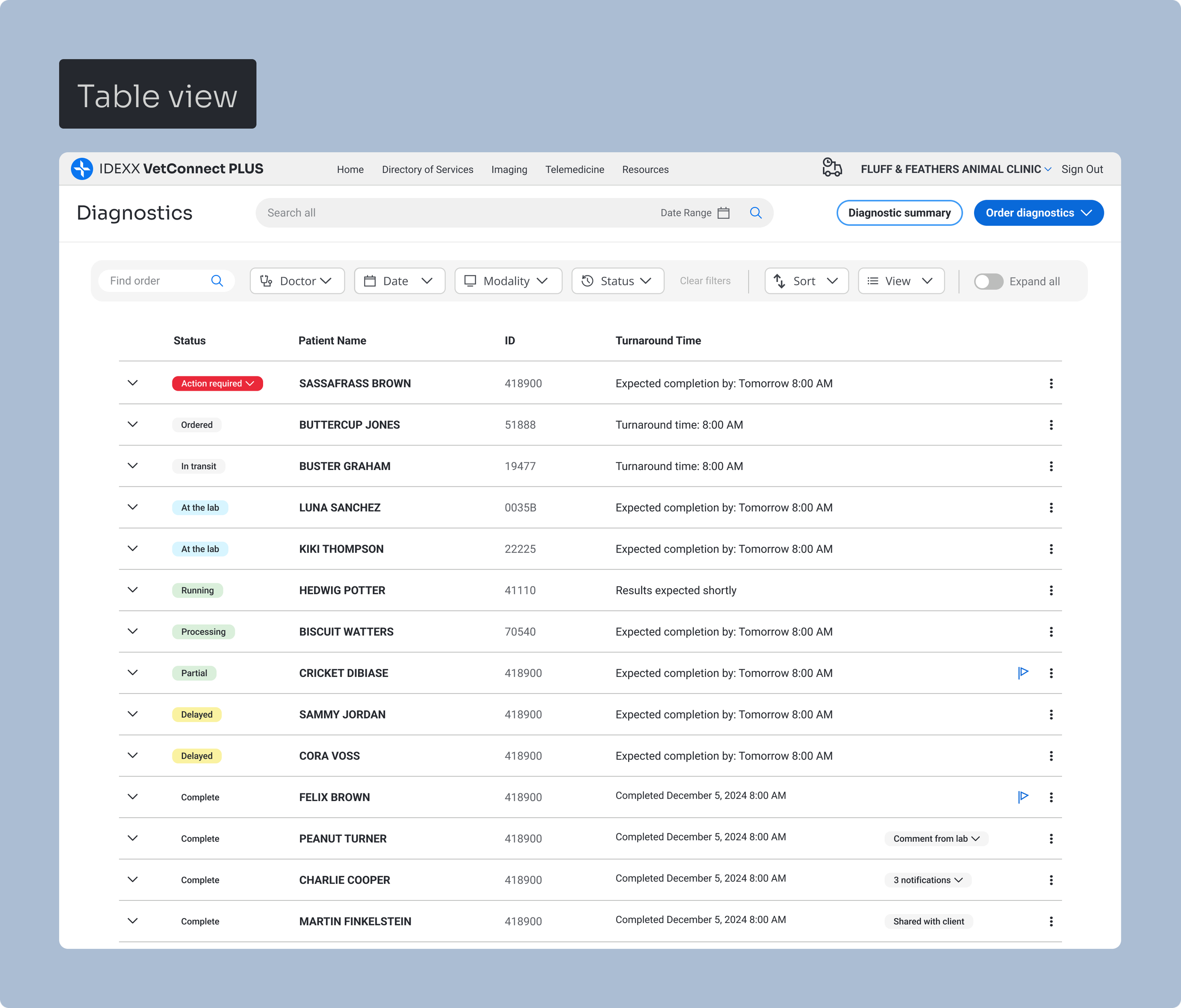
Improved order tracking and readibility
Improving efficiency: Explore with ease
Filtering: Robust filters allow users to retrieve specific orders quickly.
Actionability: Key actions are placed directly on the order list for immediate access.
Self-Service: New self-service options allow users to resolve order issues independently.
Automation: Result sharing is automated to save time and reduce manual tasks.
Optimization: An improved layout supports quicker scanning and reduced scrolling.
Prioritization: Intelligent routing automatically flags and surfaces critical orders at the top of the dashboard for quicker follow-up.
Robust filtering, self-service capabilities, and key actions
Increase scalability: Act with confidence
Adaptability: A responsive vertical tracker provides mobile parity and supports localization.
Flexibility: A new overflow menu easily accommodates a growing set of actions and workflows.
Expansion: The design allows content to scale without compromising usability.
Ecosystem: Standardized components and patterns unify the order experience across Reference Labs and in-house equipment.
Order tracking, in-house diagnostic alert, and action menus
Mobile concepts
STAKEHOLDER FEEDBACK
After several rounds of iteration and close collaboration with our cross-functional team, we presented our refined design vision to leadership. The new visual representations and clear workflow improvements sparked immediate excitement and engagement. Stakeholders were so supportive they began building on the ideas, suggesting opportunities for even greater customization and workflow refinements. This enthusiasm culminated in a strong request to partner with our UX research team to validate the new experience with users and use that feedback to guide the next iteration.

Add-on testing, courier scheduling widget, request a medical consultation
NEXT STEPS
Research and phased development
Our next phase is to partner with UX Research to de-risk the redesign. This research will validate that our proposed solutions solve the original issues and uncover any remaining gaps before full development.
Key research goals
Assess the usability and effectiveness of the proposed designs.
Measure the potential impact on task completion, self-service usability, and mobile adoption.
Gather feedback to inform final design iterations and validate stakeholder feedback.
In parallel, development is already underway on several low-risk, high-impact features, which will be released in phases:
By end of 2025: A digital courier pickup scheduling feature will be in development and released.
By end of Q2: The vertical status tracker for mobile is set to launch.
Following Q2: The updated filtering options will be released.
This phased approach allows us to maintain delivery momentum while we continue to validate and refine the broader experience.
LEARNINGS
Data helped us ask the right questions, but understanding our users' stories gave us the answers. This project reinforced that to solve a problem, you must understand the user's complete workflow, their unique challenges, and their primary need for a product that is simply effortless.
For busy veterinary professionals, software friction is a critical bottleneck. The upcoming user research will be key to validating our assumptions and proving we've removed that friction. We aren't just building a new feature; we're trying to build a tool so intuitive it fades into the background, allowing clinicians to focus on helping pets lead longer, fuller lives.